
Not many people know or take the time to learn about how different colors affect our moods. They also don’t realize that choosing the right color is important and affects how we function in a certain room. Before you begin decorating it is best to figure out what mood you are trying to create in a certain room of your home. The next step would be to choose a color that matches the feeling you are trying to create. Is the room going to be for relaxation and meditation? Socializing and entertainment? Is it a family room? A game room? Or an office and work space? Everyone is different and may have different needs for different rooms. I could say place softer tones in your bedroom, but that would be specifically because I use my room for sleep, relaxation and spending time with my hunny. Others however, may use their bedroom as a place where they do their work or collaborate on ideas, and use their living room for their place of relaxation. A good place to start would be to know the difference between cool and warm colors. Taking time to understand color theory will give you a better understanding in associating the right colors for the feeling you are trying to achieve.
Colours such as green, blue, purple and white are cool colors. Cool colors have a calming effect on a room. The colors here are associated with rest, peace and relaxation. Cool colors are best used in the bedroom, bathroom, and den. However, using lighter shades of a warm color also work great in a bedroom and have a calming effect as well. For example Colors like red (pink), light yellow, and peach can also be very nice when used in a bedroom.
Blue – wisdom, tranquility, security, confidence, loyalty (negative – depression)
Green – soothing, youth, good luck, fertility, (negative – jealously)
Purple - (violet) – good judgment, spirituality, romance
White – pure, innocence, cleanliness (negative – distant, and cold
Warm Colors  Warm colors are energizing colors. These colors are red, yellow, orange and everything in between. They are said to evoke feeling of excitement, pleasure and are fire colors. They can also be associated with anger and violence when used in certain shades. Warm colors are best suited in a room where a lot of action takes place; such as the family room, kitchen, or basement. Other warm colors include gold, brown, and black.
Red is a love-hate color – desire, strength, stimulating (negative – anger)
Yellow– Joy, creativity, concentration, sunshine (negative - laziness, deceit)
Orange– cheerfulness, energy, friendliness, inviting (negative - ignorance)
Brown– down-to-earth, wholesome, reliable (negative – sadness, wistful)
Tip1– Be very careful of the usage of yellow. Although it is a positive color it is the hardest of all the colors on the eyes because of it bright nature. It can also be very overpowering color in a room when used in large amounts.
Tip2– Green is a very popular color and works well in any room.
Tip3– Avoid colors that do not improve your mood. Certain color shades such as grey, blues, and browns invoke feelings of sadness and depression.

Tip4 – Try incorporating both warm and cool colors to create a perfect balance in a room.
Tip5– warm color add coziness to a room making the wall appear closer, while cool colors reflect light making the place seen open and airy.
Note: I cannot stress this enough, always remember shades when choosing colors. I listed the negative aspects of colors to show that different shades of a color express different moods and emotions. Also, just because colors are listed in a certain category doesn’t mean it is necessarily a cool or warm color when different colors are mixed with characteristic of different shades to create certain colors.
*Disclaimer: None of the pictures featured here are the property of Modern Sensibility. They are being used as reference to what is being discussed in said blog. All images were taken from Google.

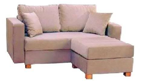 It's that time again! This month’s pick was chosen after a little store redecorating. At Modern Sensibility it's never a dull moment, from day to day, week to week our show room changes. We're constantly trying to find ways to showcase everything better and there is ALWAYS room for improvement. Last week we did a big renovation, it looks amazing and I have a new favourite that I think you should keep your eyes open for this month. The Austin is the perfect sofa for a space that just doesn't cut it size wise. No more stressing over how you're ever going to make a sofa fit into your space that won't take up the whole living room. Not only will this sofa provide an intimate seating area it also come with an ottoman to kick your feet up on, full storage under the seating area, and removable arms. It is a modern, chic loveseat designed with condos and apartments in mind.


