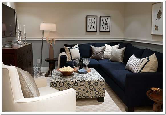
Have you recently decided to paint your home, or redecorate a room? You've started visiting the stores excited to choose the perfect colour only to realize that the possibilities were endless? Frustrated at the idea of what goes where: "Do I want the sky blue or bluebell, lavender or amethyst maybe violet." Who knew there were this many shades of ONE particular colour; even white comes in cream white, off white, opaque and the list goes on. Colours become easier to choose when you learn that specific colours and shades affect your mood in a particular room, and that there are do's and don'ts in decorating your home depending on the room and its function. A good tip is to bring home paint samples and do paint 'tests' in different areas of the home; this will help you see the colour in its true shade, and get a better feel for how it'd look in the room. A good tip is to look at home décor magazines, blogs or Google pictures of themes and styles you like so you have a better idea of how you'd like to decorate.  The living room is the place where you spend most of your time. It's the place where you relax after a long day in front of the television, spend time with your family and entertain your friends and extended family when they come over. This room is a multifunctional room and gets the most action so your colour scheme is more varied. You don't have to stick to any particular rules in this room of the house.
- Use neutrals like beige, creams, grays, and lighter tones. Pair them with bold accessories to add colour. Changing your accessory colour is easier than repainting; to change your decor simply change your accessory colours.
-Use red to make your wall stand out. Pair it with brown to tone it down.
-If you have dark colours on the wall like a navy blue, pair it with lighter tones such as white for contrast.
- Don't be afraid of colour, choose colours that pair together well.
-Follow the 60:30:10 Rules -- 60% of one colour, 30% of another colour and 10% of accents.
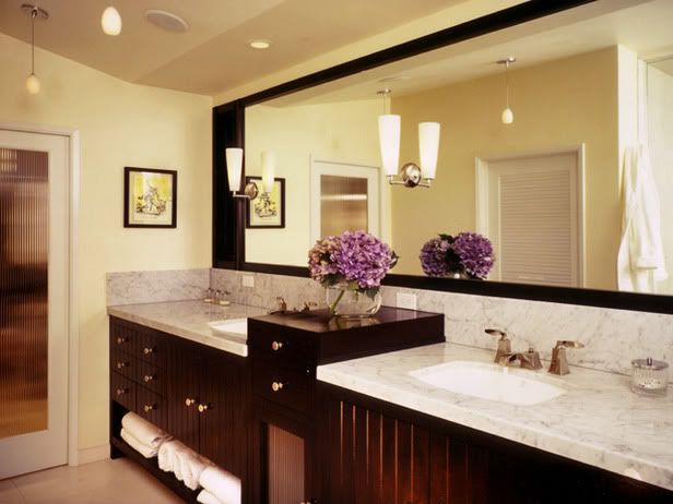
BATHROOM:
The bathroom is the place where most of your grooming and daily upkeep takes place. You want your bathroom to be a place that is soothing and relaxing, feels large and roomy and provide lots of light. People want their bathroom to feel like an at home spa (at least I do) so why not achieve that 'feeling' easily with colour.
DO:
-Use blue as a top choice in the bathroom. Choose blue in lighter hues, this will automatically create that calming and relaxing feeling.
-Using peach in the bathroom is a bonus for those who love to do all their grooming in this room. Peach reflects well on the skin and is important if you'll be doing your makeup there, or if you're a man shaving on a regular basis. Lavender is also a really good colour in the bathroom.
-White: This one is a no brainer. White is clean and simple. It is fresh and adaptable, if you think white might be a little too bland on its own dress it up with accents such as towels, and vases, maybe some flowers.
-Use your favourite colour in the bathroom. When you feel good your confidence will be better.
-Maximize the space underneath your sink. Buy a standing shelf or decorative boxes to make storing products and finding things a breeze.
DON’T:
- Use a colour that isn't flattering to you or your body type, or skin tone. This will reflect badly in a room used for grooming.
-Use too many colours in the bathroom. Since the room is so small it will feel cramped and overcrowded with multiple use of colour.
BEDROOM:
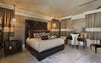
 The bedroom is the place used for ultimate relaxation. It is where you sleep, relax and watch TV under the blankets after a long day. Many suggest not using your bed for anything other than sleep, even though many of us don't listen to this rule it goes to show the bedroom is a place to relax. The colour you use in there should be ones that are used to reflect such states of relaxation.
DO:
-Use cool colours such a blue, lavender, greens, beige in the bedroom. Be careful when choosing these colours because depending on the shade or undertone it could have the opposite effect.
-Pair two 'cool' colours together to create a colour scheme that use relaxing colors in relaxing rooms.
-Make everything in your bedroom beautiful, if everything around you is beautiful you will also feel beautiful in there.
-If space allows, create a sitting area in your bedroom. If you’re having close friends over and you’re spending time in the bedroom they have a place to sit other than your bed.
DON’T
-Choose loud colours such as red, hot pink, royal blue, or bright sun yellow. This will disturb the flow of the room and instead of feeling calm and relaxed you'll feel fidgeting, angry or irritated.
- Put an office in your room. It will constantly remind you of work to be done, and take away from relaxation and sleep.
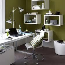
The office is the place in the home that is used to concentrate, stay organized, and get work done. This is the place where you WORK, nothing else should be done in this room because you want to associate this room with work and concentration. This is the place to be completely focused so that you can complete the tasks at hand with ease and increase productivity.
DO:
-Use colours such as green and yellow which inspire concentration in an office. Neutral colors like lemons, pastel blues and creams are also good color choices.
--Go with a bright colour over a neutral if you work in advertising, or a job that require creativity. Bright colours are said to stimulate your mind and appeal to your creative mind.
-Combine a professional space, with the luxury of comfort. Use a comfortable chair and a good sturdy table.
-Make it inviting. This is the place where you will have meetings with clients, or other business people. Having adequate seating space maybe a bench or love seat and two chairs would make it look like you're ready for business.
-Try to get as much natural lighting in the room as possible, this tip holds true for every room.
DON'T:
- Mix your home life with your work space. Try to keep them as separate as possible. Treat it as if your home office is your office away from home.
Example: Don't eat, or watch TV in there do that in your respective room. Matter of fact do not even attempt to put a TV anywhere near your home office.
- Clutter your office. Buy bins, and boxes that go with your colour scheme and label them so you know the contents of the box. Not only will this help keep you organized but it will add a decorative touch to the room as well.
- Use distracting colours. Colours such as red will make you feel irritable in a home office.
- Put your office in a high traffic area of the house. Try to keep away from noise and any outside distraction. This will help you keep more concentrated on what you have to do. If you have a family, work time should be work time. You won't be tempted to check up on the household with every noise you hear.
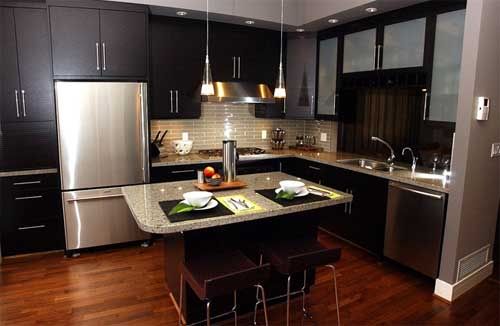
KITCHEN:
The kitchen is the most important area of the house. It is the place used to cook meals and is a meeting place for families. The kitchen is the heart of the home. Sterilization and cleanliness are at the utmost importance here.
 DO:
DO:-Use red in the kitchen to build an appetite. If you don't want to go all out using red, pair it with a neutral colour for the same effect.
- Use white if you're someone who likes to try out different meals and recipes in the kitchen. It is said to help with creativity.
-Keep everything neat and tidy and in its place. Use fun storage ideas that keep everything in sight but not in the way.
-Add an element of comfort to the kitchen, whatever that may be for you. This is the place where your family will gather to talk and eat, and should be inviting to guests as well.
DON’T:
-Use carpet in the kitchen or hard to clean flooring. The kitchen floor is always getting dirty with spills and food and dirt you want to be able to easily mop or sweep it up. Hard to clean floors will eventually look grimy and unpleasing to the eye; even after a good cleanup.
-Hang anything over the stove; this is a cause for safety concerns.
- Make it harder for yourself to stay organized in the kitchen. Purchase shelves, racks, and bins for under the cabinets to keep your pots, pans and storage containers organized and easy to reach.
-Avoid Lighting, natural or otherwise. Light brightens up the whole space and automatically makes it feel warm and inviting.


